A framework is a standardized set of concepts, practices, and criteria for dealing with a common type of problem, which can be used as a reference to help us approach and resolve new problems of a similar nature. It is a package of a structure of files and folders of standardised code like HTML, CSS, etc. which can be used to support the development of websites.
The aim of frameworks is to provide a common structure to the developers. In this way, frameworks allow us to cut out much of the work and save a lot of time. Good responsive CSS frameworks are very much in demand because they are easy to use and time savers. They save you from the trouble of writing base CSS styles etc.
Frontend Frameworks (or CSS Frameworks)
They consist of a package made up of a structure of files and folders of standardized code (HTML, CSS, JS documents, etc.) with standard components like:
- CSS source code to create a grid, which allows the developer to position the different elements that make up the site design.
- Solutions for browser incompatibility, so the site displays uniform in all browsers.
- It allows the creation of standard CSS classes.
- The Style definitions for HTML elements.
About responsive frameworks:
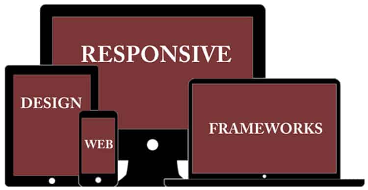
The rise of responsive web design techniques for websites that can adapt to various resolutions for different digital devices is leading to the emergence of responsive frameworks.
- Bootstrap
Created by a developer and designer at Twitter in mid-2010. It’s also known as the ‘Twitter Bootstrap’. Immediately after releasing this framework, it became the most popular front-end frameworks and open source projects in the World. Bootstrap has unmatched features, grid system, navigation elements and much more. You can build any website out of it with much ease and fun. The freelance web designers are finding it an interesting platform.
- Skeleton
Skeleton is not full CSS Framework. It’s rather a development kit that provides most basic styles for your project. It is a small collection of CSS files that powers up your development speed and your website looks great at any size. Skeletons support for grid, typography, buttons and forms makes it one of choice to develop a responsive website.
- Gumby
Gumby Framework is a responsive CSS framework which includes multiple types of grids with different column variations which enable you to be flexible throughout an entire project’s lifecycle. With Flexible Grid, Responsive Images, Shuffle and well defined UI Kit, Gumby is also one of best responsive CSS Frameworks available today. This framework also uses Syntactically Awesome Stylesheet (SASS).
- YAML 4
YAML (Yet Another Multicolumn Layout) is a cross-browser CSS framework. It allows you to create a low-barrier website with comparatively little effort. Integrations of this framework have created various content management systems. It is a modular CSS framework for truly flexible, accessible and responsive websites. It is tested and supported in major browsers like Chrome, Firefox, Opera, Safari and Internet Explorer.
- Susy
This one is a nice semantic CSS grid system with a flavor of the responsive framework. These grids are easy to mold according to your choice, as to when, where and how you wish them to respond. It can help you make your website look different and unlettered.
- Pure
This framework consists of small and responsive CSS modules that you can use in every web project. It is a great tool because you can use these pieces for any project even if you are using other frameworks or interested in using only these modules, but not the entire Pure framework. Worth taking a look at if you are building responsive websites.
- Less Framework 4
The Less Framework is also a CSS grid system for designing responsive websites. It comes with 4 layouts and 3 sets of typography you can use based on a single grid system. The advantage of this Framework is that you can use it to create various layout types and reuse parts of one layout into another layout without changing a lot of code.
- The Responsive Grid System
The Responsive Grid System is an approach to responsive design in that it claims to plug into your existing HTLM and CSS code. It is a very simple responsive grid system which you can add to an existing site that is not yet responsive. It is a great option if you simply want a very straightforward responsive grid system without any other functionality.
- Foundation
Developed by Zurb, Foundation is a feature rich, responsive framework. It has SASS available with the install as well as a diverse library of features such as modal, Improved Canvas, GPU acceleration, etc. for the front-end developers and freelance web developers. It is truly an enterprise level responsive framework that can take any site to the next level.
- Barekit
The Barekit framework is another minimalist responsive framework that comes with no styling that you might find in other frameworks. Barekit is a new responsive framework that has just been released by AppendTo, so it’s worth checking it out.
How to choose the right Framework?
- Using a complete framework for a single page site may give an adequate result, but surely misses out on many other resources.
- All above frameworks are great to use, and you can select anyone for your website for quick development.
Pointers to decide on your Framework:
- Some are very simple to install and start using. Others require more time to configure. Look at the configuration options also.
- Some frameworks are a bit of a pain to get to grips with, and others are comparatively simple and straightforward. Select the one you find easy.
- It’s always better to select the one that offers continued support.
Advantages and disadvantages of using frameworks:
Advantages
- Speeds up the mock-up process
- Clean and tidy code famous amongst freelance gigs for quick development
- Solutions to common CSS problems
- Browser compatibility
- Having a single procedure to resolve common problems makes maintaining various projects more straightforward.
Disadvantages
- Mixes content and presentation
- Unused code leftover
- Slower learning curve
- You don’t learn to do it yourself