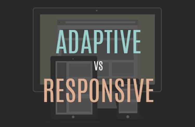
The designer choice starts and ends with this two choice, both responsive and adaptive design. The effort to optimize the user experience on different gadgets, adjusting viewport size in different devices, resolution, control apparatus, etc. The first context of the topic is making you well aware of what one should prefer when it comes to the matter of designing a website which is compatible e with any devices and fits in any resolution. For your site design, you can choose various web designer from online sources and hire freelancers who deliver the best logical service by creating your website for maximum compatibility with every device people use.
Responsive web design works on the principle of flexibility. The plan deals with the basic site that can look good on any devices. Responsive design method uses various media queries, flexible grids, images to create a better user experience that changes on a gathering of factors.
On the other side, adaptive web design is more than just responsive, or it is more progressive context as to responsive design. This method for a designer not just give flexibility. Instead, it deals with the multiple flexible designs which detect the device and other configuration of the gadgets and then provide the certain feature and layout based on the compatible features of viewer devices and other characteristics.
From User experience
With mobile devices, PCs, tablets and all other devices achieving the field of technology faster than most can keep up. The growing address of this changes enables all designer to look at the factor of user interaction and acceptance of their website on trending pocket-sized gadgets. In today’s world user who accesses your web pages through their different device or various display screen do not bother about what method for web designing you are using, they only care about is your content and websites details are showing on their respective devices or not.
Now it’s up to you to know about the both design similarity and differences and which will beneficial for your viewer point of view. The design method is both addressing the issue for rendering websites on mobile devices. Following are the differences between this two web design methods:
The term RESPONSIVE WEB DESIGN coined by Ethan Marcotte. He also published many article and books over this topic and following are his key point listed below. A responsive website design starts with the basic common task of
- Incorporating CSS3
- Media queries
- The @media rule
- Fluid grids that deal with
- Percentages
- EM,s
- Flexible videos, images
- And all other fluid type allow the responsive website to adapt its layout with the viewer device, user environment, etc.
The term ADAPTIVE WEB DESIGN coined by Aaron Gustafson, who has also written many books on this designing topic with its functionality. He mainly focuses on essential utilize factor on components of progressive enhancement (PE) as a way to define modern adaptive web design methodology on the user, not the browser. He proclaimed that using a predefined set of layout sizes based on various device screen resolution along with the amalgamation of CSS & JavaScript. The three layers of progressive enhancement are as follows:
- Content layer =rich semantic HTML mark-up
- Presentation layer = CSS & different styling
- Client-side scripting layer = jQuery or JavaScript behaviour.
Responsibility relying on flexibility and fluid grids and Adaptive web design relying on predefined screen resolution.Following are extended freelance tips which will help you first to find out differences between these two web designing method and then choosing the best web designer for your website.
- One of the genuine differences between this web design methods is responsive web design implement the coding with the fluid grids, CSS, and flexible foundations, while adaptive has a layered approach which uses scripting to enhance with various adaptive gadgets and their screen sizes.
- The adaptive design could also enable how we optimize and analyse loading times & experience performance for smaller handles devices.
- With responsive web design, the use of media queries also increased up to the large range of option that enables for layouts along with another style.
- Adaptive web designing method works to detect the screen sizes and load the perfect layout for it. It designs for six common screen resolution (width):
- 320
- 480
- 760
- 960
- 1200
- 1600
On the surface, it appears that adaptive design more emphasis as you design layout for a minimum of six different sizes. And thus irresponsive can be more complex as the incorrect use of media queries and can make for display and performance issue in viewer gadgets.
- The majority of the new website owner designing their website with responsive web design method, which is easier and nor recommends experienced designer and developers. It is as like CMS systems sites like WordPress, Joomla, and Drupal where various themes are accessible.
- Responsive does not offer as much control as adaptive, but it took less time and worked to build and design.
Conclusion:
As discussed earlier, responsive web design delivers issue when it comes to the site loading speed if they aren’t implemented properly. It also requires more coding to fit with the devices screen size which is accessing the gadgets. In context to adaptive design, since adaptive design requires that you maintain and develop separate HTML & CSS coding work for each distinct layout. Choose what according to you can deliver the best user experience to your site viewer. Now you have an overview of the major differences and similarities between this two web design methods analyse it properly, see the differences by surfing some quality site which deals with adaptive and responsive distinctly and then goes for the best option.