Sign-up forms assist businesses in increasing their email lists and discovering more about the individuals interested in their brand and products, in addition to improving leads and conversions.
They are simple to create and can be placed anywhere on your website.
Registration forms are an excellent method to gather client information for your next event or product launch.
74% of businesses utilize web forms for lead generation, with 49.7% claiming that their web forms are their most effective lead-generating strategy.
As you continue to read, get clarity regarding developing an engaging sign-up form for your website and what to add to make the most of it.
13 strategies to create a high-converting sign-up form
The purpose of your sign-up form is to allow website visitors to opt into your newsletters or learn more about your company.
An excellent condition simplifies the opt-in process and enhances conversions. But what constitutes a decent sign-up form?
These tips will help you create a compelling sign-up form that will bring you closer to your intended outcome: more leads.
1. Maintain simplicity
Maintain a straightforward and easy-to-fill-out form. Remove any extraneous text and unneeded fields. Remember, in the case of web forms, the more fields there are, the less likely a person is to fill out the form. In fact, in one case, fewer fields can result in a 120% increase in conversions. Studies show that fewer form fields have the highest conversion rates.
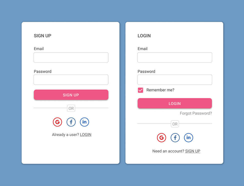
2. Use a single column rather than two
When a lead fills out a sign-up form, you want to provide them with a simple end-to-end experience, and a single-column form is an ideal way to accomplish that. Two-column sign-up forms might make reading difficult or cause lead to misreading the fields.
Only when the questions are so closely connected will your leads make more sense to fill them next to one another if you arrange numerous fields on one line. For example, the first and last name form fields must be adjacent.
3. Do not request information twice
Have you ever completed a form to be prompted to enter your password twice? Sure, it helps to assure form correctness and validity, but asking leads for duplicate information is unnecessary, especially when there are alternatives that will make the process less time-consuming.
Unmask passwords, for example, so users can double-check their data before completing the form.
According to Google, users fill out forms 30% faster with autocomplete than without.
Advanced form builders use progressive profiling to prevent repeat visitors from being given the same questions when they visit a website. If a potential customer signed up for one of your offers and returned to your site to fill out yet another form, your form builder will remember the lead and either auto-complete their known information or eliminate duplicate questions from the form entirely. This not only makes the form-filling process as swift and straightforward as possible, but it also gives a great user experience.
4. Use an eye-catching CTA button
Present a clear call-to-action, or “submit” button, to your leads. CTA buttons are vital since they indicate how a lead must submit the form they just finished. The CTA button must be large and bold so that it is easy to notice and utilize – it must make your leads feel confident that the appropriate people will see the information they are entering.
The best performing CTA buttons text includes: “Click Here,” “Go,” “Download,” and “Register.”
5. Remove distractions
You must only use sign-up forms to generate leads. This includes removing distractions such as advertisements, superfluous language, photographs, and videos. Consider using a pop-up, a separate landing page, or a clean location on your site to keep your customers focused on the work at hand – filling out your form.
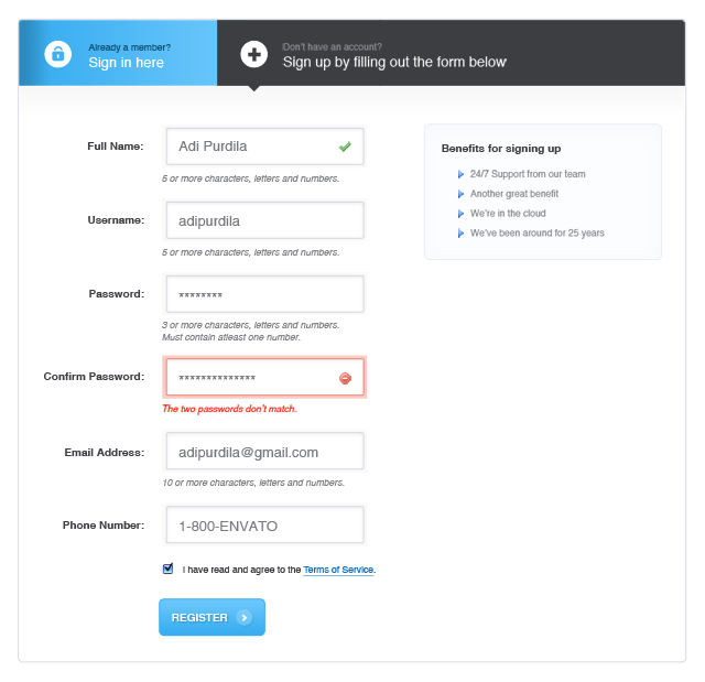
6. Make use of inline form validation
Inline form validation displays an error notice to leads who enter wrong information into form fields, preventing them from submitting the form until the problem is corrected.
For example, someone can submit an incorrect password, enter an invalid phone number, or be missing a few characters in their zip code. Your formsvare useless if someone submitted them with this incorrect information. Inline form validation guarantees that only accurate information is input, saving everyone time.
7. Think about text and form field box alignment
Align your content, so it’s easy to read and follow while creating your sign-up form. The best is to place the text above your form fields (not below or to the side). When your leads read “Name,” they know to enter their information in the form space below. People are generally used to reading from left to right and filling out forms in a single-column style, so keeping consistency is critical.
8. Emphasize the importance of signing up
Mention the value of signing up on your form, whether you’re giving a free trial, first-time purchase discount, weekly newsletter, or crucial corporate information about new goods and services. This will pique your leads’ interest and motivate them to fill out the form sections. Currently, 34% of retailers have this feature on their websites.

9. Provide social proof
Social proof is a technique for showing potential leads that others are taking action by filling out your form, and they must do so as well.
70% of internet shoppers read product reviews before making a purchase decision. That is why marketers frequently utilize social proof to entice visitors to fill out sign-up forms.
Studies have shown that product reviews published by genuine consumers are 12x more trustworthy than product descriptions produced by firms and manufacturers. A testimonial quotation, a product review, or a submission counter might all be examples of social proof.
For example, when one eBook author included social proof (in the form of testimonials) on his website, he saw a 64% boost in downloads and email sign-ups, not bad! People are more likely to trust you and your company when they see social proof, which increases conversions.
10. Make your form appear presentable
Did you know that 38% of consumers will abandon a website if the content and design are visually unappealing or unpleasant?
People are interested in the design of your sign-up form. Make your form seem professional, visually appealing, and consistent with the rest of your business. Make an enduring impression on your leads by taking the time to design a stunning form.
11. Inform your leads about what happens when they sign up
When someone completes your sign-up form, inform them of the following steps. Your new lead must know how and when they will hear from you, whether it’s a weekly email, upcoming product releases, quarterly business news, or a yearly check-in.
Directing your new lead to a “thank you” page or delivering an inline message as they complete a form is a standard approach. After all, they did stop whatever they were doing to give you their information freely.
12. Avoid using CAPTCHAs on forms
CAPTCHAs are tests that require you to input a code or identify pictures in a photo before you submit a form. Their goal is to detect bots and reduce SPAM. When your form’s CAPTCHA is enabled, you will likely experience a greater rate of form abandonment.
However, completing a CAPTCHA is difficult, time-consuming, and sometimes frustrating. Not to add that CAPTCHAs are no longer as effective as they once were since computers have improved at simulating humans. If you’re concerned about SPAM, you use reCAPTCHA, which allows leads to check a box that indicates, “I’m not a robot,” and then go about their business.
13. Put your sign-up forms to the test
First, ensure that your form is functional. Your leads must have no trouble submitting their information to your server. Then, using an A/B test, determine which variant of your form is the most effective.

How registration form templates help your websites
With online registration forms, plan and execute your registration process quickly, making it easier for attendees to attend your conference, workshop, class, or summer camp. You can choose a simple click-here template and personalize it for your next online event .
Email notifications, auto-reply messages, and the option to integrate payment processors to collect registration fees are all great examples. For a varied selection, click here for registration form templates. Easily customize it using drag-and-drop form builder.
Sample registration templates perform best on smartphones, desktop computers, and tablets. Customers, workers, and students use any device and any location to complete any of our example registration forms. Make your free forms right now!
How can I make a free registration form template using form builders?
Creating online registration forms is a breeze with templates.
There are only three basic procedures involved, and no coding is required.
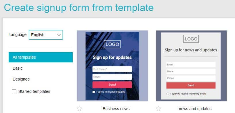
1. Select a sample registration form
Choose from various online-accessible registration form templates or construct your registration form from scratch by dragging and dropping fields into the form.
2. Modify the online registration form
Customize your form with conditional logic, your design, your preferred payment processor, email notifications, and even a Google Calendar integration (to prevent attendees from forgetting about your event).
3. Distribute the online registration form where necessary
Publicize your online registration form everywhere you choose in cyberspace, such as on your website or social media feeds.
Final thoughts
Sign-up forms help generate leads and grow your email list. They also provide information on the individuals most interested in your brand, goods, and services. You will improve conversions using a straightforward, aesthetically appealing, easy-to-use sign-up form. You can even hire freelancers to do this job for you.
Featured Image Source